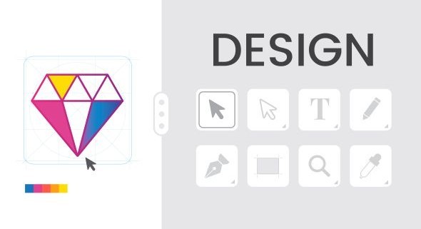
Ten Tips On Designing The Best Icon Designs
key to how we use websites, apps, and software. These small but powerful pictures guide us, helping us know what to do instantly. What makes a great icon different from one that just works? It's a mix of art, mind games, and smart design. Bad icons can confuse people and make a brand look weak. But good icons make things easy to use. They create a good experience and make a brand stronger. This article shows you how to make your icon designs go from okay to unforgettable.
In this guide, we'll share ten important tips. These will help you make icon designs that look good and connect with your users. We'll talk about everything. This includes knowing how visuals talk to people, using new design ideas, and testing your work for best results. No matter if you design for years or just started, these ideas give you a strong plan. They help you make icons that are clear, always the same, and truly liked by users.
1. Understand the Purpose and Context of Your Icons
Before you start any visual design, you need a basic understanding. Icon design isn't just about how things look. It is about talking clearly within a specific place. Think about why you are making the icon and where it will live. This first step sets up all your design choices.
1.1 Define the Icon's Core Function
Every icon serves a purpose. Ask yourself what action or idea this icon stands for. How will people use it? Will they click on it, or is it just for information? Always consider the main thing it helps the user do. Knowing its job makes the design clear.
1.2 Analyze the Target Audience and Platform
Who are your users? Think about their age, how good they are with tech, and their cultural backgrounds. Where will your icons show up? Will they be on a phone app, a website, or computer software? Remember platform rules and what users expect. For instance, iOS apps often look different from Android apps.
1.3 Research Existing Iconography and Competitors
Look at what's already out there. What common pictures do people already understand for certain jobs? Find icon designs that work well and those that don't in similar products. Try not to make icons that look too much like others. This helps stop people from getting confused.
2. Prioritize Simplicity and Clarity
Good icon design means making tricky ideas easy to get. You do this with very few visual parts. Simple designs are often the strongest. They get the message across fast.
2.1 Embrace Minimalist Design Principles
Cut out visual mess. Focus on only the shapes and lines that are most important. "Less is more" is a big rule for icon design. Start with a basic shape. Then, add only the details you truly need. This keeps things clean and effective.
2.2 Ensure Recognizability at Small Sizes
Icons must be easy to read even when tiny. This means they should be clear at sizes like 16x16 pixels. Don't add complex details that will vanish or look blurry. Always check how icons look on screens with different pixel densities. Think about the small app icons on your phone's main screen.
2.3 Use Clear and Universal Metaphors
Use pictures that most people already know. This uses visual language everyone understands. For example, a house icon means "home." An envelope means "email," and a magnifying glass means "search." Designers like Susan Kare, known for early Apple icons, were great at using clear symbols.
3. Maintain Consistency Across Your Icon Set
A good set of icons should all look like they belong together. This makes for a smooth and professional user experience. Consistency helps people learn and remember your product's look.
3.1 Establish a Visual Style Guide
Make a guide for your icon style. This guide should set rules for grid systems, how thick lines are, how lines end, rounded corners, and fill styles. Also, decide on colors and how to use them. Write down rules for how things look in 3D or with shadows, if you use them.
3.2 Use a Consistent Pixel Grid and Line Weights
Line up your icons to a common grid. This helps them sit perfectly and scale right. Using the same line thickness keeps things from looking messy when icons are together. Always design all icons inside the same box size. This makes sure they are always uniform.
3.3 Apply Consistent Color and Typography (if applicable)
Colors for icons should match your brand. They also should mean something specific. For example, red often means an error. If you use text in icons, make sure it's the same font and style every time. This helps keep the overall look neat.
4. Focus on Scalability and Responsiveness
Icons need to look good on any screen size or resolution. This section covers how to make sure your icons can change smoothly. They should adapt to different devices without losing quality.
4.1 Design for Vector Formats (SVG)
Vector pictures can get bigger or smaller without losing quality. SVG is the best choice for web and new apps. Always save your finished icons as SVGs. This makes sure they look crisp no matter how large they become.
4.2 Test Icons on Various Screen Sizes and Resolutions
Check your icons on phones, tablets, and computers. Make sure they are clear and easy to read on high-quality screens like Retina displays. Data from Statista shows that phones made up over half of all website visits in 2023. This means designing icons for phones first is very important.
4.3 Consider Responsive Iconography Solutions
Some platforms let you have different versions of icons. These might change based on screen size or where they are used. For example, a desktop icon might have more detail. A phone icon could be a simpler version of the same thing.
5. Test and Iterate Your Icon Designs
Making icons is a process that keeps changing. You improve them based on what users say and how they perform. Testing is key to making sure your icons work as intended.
5.1 Conduct Usability Testing
Watch real people use your app or website with your icons. See if any icons confuse them or make them hesitate. A good way to test is to ask users what they think an icon means before they click it. This can show if your message is clear.
5.2 Gather Feedback from Stakeholders and Peers
Show your icon set to your team, clients, or other designers. Ask them about how clear the icons are, if they are all the same, and if they look good. Fresh eyes often catch things you might have missed.
5.3 Make Data-Driven Revisions
Use what you learn from testing and feedback to make your designs better. Be ready to change shapes, colors, and small details. For example, if your "save" icon is often mixed up with a "download" icon, change how it looks.
6. Leverage Color and Contrast Effectively
Color and contrast help make icons look nice. They also help make icons easier to use and understand. How you use them can add meaning to your design.
6.1 Use Color Purposefully and Sparingly
Color can show status, meaning, or your brand. Using too much color can make things confusing and distracting. Give specific colors to actions, like active or inactive states, or to different groups of items. This makes color a tool, not just decoration.
6.2 Ensure Sufficient Contrast for Accessibility
Icons must stand out from their background easily. Follow the rules for contrast ratios from WCAG (Web Content Accessibility Guidelines). WebAIM reports that poor contrast is a common problem for people who cannot see well. Good contrast makes icons usable for everyone.
6.3 Consider Color Blindness and Grayscale Rendering
Design icons so they make sense even without color. Avoid putting all important information only in color. For example, a green checkmark for success and a red 'X' for error should still look different in shape. This way, colorblind users or those viewing in black and white can still tell them apart.
Conclusion
Making the best icon designs takes careful work. It mixes good looks with clear meaning. When you know your users, keep things looking the same, make them simple, and test them often, you build icon sets that make users happy. They also make your brand look strong. Icons are more than just small pictures. They are key parts of the user's journey. They guide, inform, and please. Use these ten tips. They will help make sure your icons not only look good but also make sense right away. This leads to smooth and positive interactions with what you create.